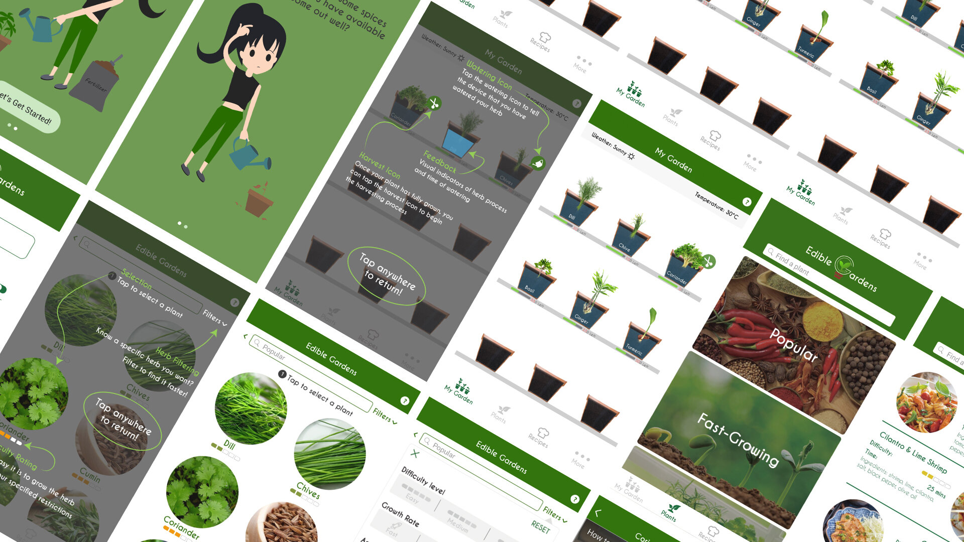
Edible Garden Iphone Application
A mobile application that is designed to help people who has a shared concern for dietary health but who rarely has any experience of taking care of plants.
Project Details
TEAM: Ella Meng, Jodie Chang, Nora Ning, & Joanna Lin
TOOL USED: Invision, Adobe XD, Axure RP, Illustrator, Photoshop
ROLES: Developer, Interface Designer, Graphic designer, & Researcher
DURATION: 3-week project for a senior interface design course
Project Context
The popularity of organic food is steadily rising due to its numerous health benefits, particularly its ability to significantly reduce our exposure to potentially harmful pesticides. However, not everyone can afford organic produce, prompting an alternative solution: growing our own food within the confines of our homes. Unfortunately, our target audience, comprised mainly of younger generations residing in urban areas, often lack experience in plant care. This is where the Edible Garden application comes in, with the primary objective of teaching users how to cultivate their own organic herbs, harvest them, and ultimately incorporate them into their cooking routines.
Developed by a team of four, my role in this project involved building the application using Axure. I focused on designing the visually appealing and user-friendly My Garden tab, which allows users to monitor the growth progress of both virtual and real plants. Additionally, I crafted the application's splash screen to not only provide a visual introduction to novice users but also guide them through the initial steps of getting started with the app.
Stage 1: Research, Personas, Interaction Framework
In the initial stage of our project, we embarked on thorough research, which included conducting an online survey and carrying out oral interviews. Through this process, we discovered an intriguing trend among our participants: despite having minimal gardening experience, they expressed a strong emphasis on prioritizing their health. Many of them expressed a desire to learn how to cultivate their own food, as a means of understanding and controlling what goes into the meals they consume.
By gathering this valuable insight from our research, we were able to develop a set of personas that represented our target audience accurately. These personas served as a foundation for shaping the features and functionalities of our application. We aimed to address the needs and desires expressed by our users, who were predominantly young individuals living in urban areas with limited exposure to gardening.
To ensure a cohesive and intuitive user experience, we also crafted an interaction framework. This framework delineated the various interactions and processes that users would engage with while utilizing our application. It helped us establish a clear and structured pathway for users to follow, ensuring they could easily navigate the app and effectively learn the intricacies of gardening.
Through meticulous research, the identification of user personas, and the development of an interaction framework, we laid a solid foundation for the subsequent stages of our project. These initial steps were crucial in ensuring that our application would meet the specific needs and aspirations of our target audience.
Based on the research findings, we developed two personas. Consequently, these personas will assist us in guiding our design decisions and keeping our focus on the essential elements of our app.
Additionally, we devised an interaction framework to outline the user journey for both intermediate and beginner users of our app. This framework proved invaluable in identifying the specific elements we needed to create in order to address all user concerns and fulfill their needs.
Stage 2: Prototyping The Interaction
In stage 2 of our process, each team member took responsibility for developing grey-box wireframes for various tabs of our app. These wireframes allowed us to experiment with how our features might appear within the app. We primarily focused on creating and refining our designs using grey-box wireframes before selecting a few to develop into high-fidelity wireframes.
Stage 3: Building The Interactive Prototype
After completing stage 2, each team member was tasked with converting their grey-box wireframes into high-fidelity wireframes. I experimented with the design of the "My Garden" tab using Illustrator and After Effects, creating a video to help visualize the flow of interaction and the overall look and feel of the design. However, based on feedback from some of our participants during later user testing, it was noted that the vector plants made similar plants unrecognizable. To address this, I refined the design to incorporate actual plants.
Once we had converted our designs into high-fidelity wireframes and exported them as PNG files, we utilized InVision as our prototyping tool for mapping out the interaction. Each team member incorporated blue hotspots to establish connections between different PNG screens. In order to demonstrate transitions, we manually changed or updated the images in Illustrator for each user interaction, resulting in a series of images that may appear very similar but represent different interactions.
However, as we progressed with the InVision prototyping tool, we encountered increasing complexity. The growing number of images required to map out even a simple user interaction became cumbersome to manage. The possibility of different orders of interaction further compounded the issue, making the prototype difficult to control. During user testing, bugs were identified in our prototype, resulting in unexpected interactions. For example, an image that should not have appeared would suddenly show up when a user clicked on one of the hotspots.
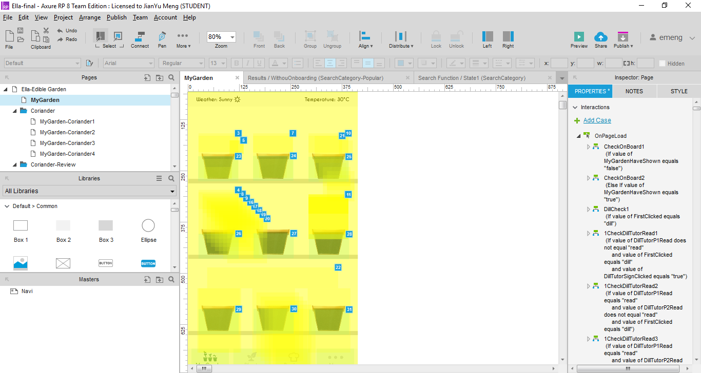
Therefore, I proposed using a different prototyping tool to better map out the user experience. After conducting tests on my own, I explored Adobe XD and Axure RP. While experimenting with Adobe XD, I discovered that it lacks a timed transition effect that could be utilized for animating interactions when the user loads a screen or clicks on a button.
After testing InVision and Adobe XD, I came to the realization that these prototyping tools did not meet our requirements. Consequently, I made the decision to use Axure RP instead. However, while working on the application alone in Axure, I encountered challenges in keeping track of interactions. As more interactions were added, the project became increasingly complex, with numerous hidden layers and countless conditional statements. Managing the project became extremely difficult, and at times it felt almost unmanageable. Nevertheless, I persevered and dedicated endless hours to complete the entire application.
Final Result And Overall Interaction Flow
Displayed on the left is the final result of our prototype, showcasing the interaction and navigation process for potential users.
Takeaways
Although we had issues with the prototyping tools we initially decided to use near the end of the project, I was glad that I was able to try out two more prototyping tools, and finally decided on one that suits us the best. Even though I had to manage my time efficiently to get everything together on my own before the deadline, I learned the advantages and disadvantages of different prototyping tools, which would help me to make a more rational decision on which tool to use next time to achieve different needs. Even though it was a lot of work to combine everything in Axure myself, I found it beneficial, as I learned more and got more used to this prototyping tools.


