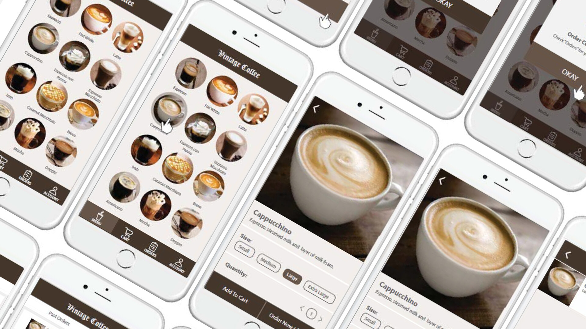
Vintage Coffee Ordering & Delivery Interaction Design
A social media interface which is designed to represent a potential social media user profile page layout.
Project Details
TOOL USED: Illustrator
ROLE: UI & UX Designer
DURATION: 2-day individual project for a interface design course
Project Context
In the realm of mobile app ordering for drinks, it is essential to prioritize clarity and simplicity in displaying available options to customers. The interface design for this coffee app focuses on presenting the product lists in a straightforward manner. Our aim is to ensure that even new customers can easily locate and order their desired drink without prior knowledge of specific drink categories. The app's design strives to eliminate any confusion or complexity in the ordering process, allowing users to navigate the menu effortlessly.
Additionally, the app places significant emphasis on streamlining the delivery process. Clear and constant feedback is provided to customers regarding the progress of their order, including the location of the delivery person and an estimated time of arrival. By providing this real-time information, customers can remain informed and have a better understanding of how long they need to wait for their drink to arrive.
Overall, the interface design of this coffee app aims to enhance user experience by ensuring simplicity, clarity, and seamless navigation, both during the drink selection process and throughout the delivery journey.
Stage 1: Ideation
During the initial ideation stage, my classmates and I engaged in a collaborative session, utilizing sticky notes to capture our collective thoughts on the essential elements of a coffee app. Two prominent elements that emerged from our discussions were the menu ordering system and the need for real-time feedback on the delivery process. Recognizing the significance of these aspects, I swiftly sketched out several preliminary layouts to explore potential design options. These sketches served as a visual exploration, allowing us to visualize different arrangements and arrangements before progressing to the wireframing phase.
Stage 2: Medium-fidelity Wireframes
After careful consideration, I selected one of my sketches to be re-created as medium-fidelity wireframes. The concept behind this design was to incorporate a turnable wheel on the page, providing customers with a comprehensive list of available coffee options. By allowing users to turn the wheel left or right, they could explore and browse through the various coffee choices. However, during the mock-up creation phase, I recognized that this design approach had its limitations. Particularly, as the list of coffee options grew larger, the turnable wheel had the potential to hide some of the choices, creating an inconvenience for customers in quickly locating and ordering their desired drink. Consequently, I decided not to proceed with this design direction in the final mock-up.
Stage 3: High-fidelity Mock-up
As I progressed with creating the high-fidelity wireframes, I made the decision to showcase all the coffee options on a single screen, complete with accompanying photos. This design approach aimed to expedite the drink selection process by eliminating the need for customers to navigate through different categories. By presenting all the options on one screen, users could easily scroll down and explore different types of coffee, discovering new or unfamiliar options along the way.
Additionally, I incorporated visual indicators for tracking the delivery progress. This included checkmarks and loading icons to provide customers with clear feedback on the current stage of the delivery process. These visual cues helped users stay informed and provided reassurance about the status of their order.
By adopting these design choices, I aimed to create a seamless and efficient user experience. The comprehensive display of coffee options and intuitive delivery progress indicators were intended to simplify the ordering process and enhance customer satisfaction.
Challenges & Takeaways
During the wireframing process, I came to the realization that errors or design flaws can sometimes persist into subsequent stages. This highlighted the importance of incorporating peer review and feedback during the ideation phase. By involving peers in the early stages of design, potential issues and improvements can be identified and addressed, minimizing the risk of carrying mistakes forward.
Given additional time, I would have dedicated more attention to the customization section of the coffee app. Specifically, I would have expanded on the options for customizing the coffee, such as allowing users to select their preferred sugar level and amount of cream. This level of customization would have enhanced the user experience by accommodating individual preferences and providing a more tailored coffee ordering process.
This reflection emphasizes the value of iterative design and the importance of seeking input from others. Through collaboration and ongoing refinement, the overall quality and effectiveness of the design can be continuously improved.


